KWWidgets/Projects/UIDesigner/Application/PreviousWork/GladeStudyResults
Glade(¹)
- Glade is a free user interface builder for GTK+ and GNOME, released under the GNU GPL License.
- The user interfaces designed in Glade are saved as XML, and by using the libglade library these can be loaded by applications dynamically as needed. (Glade can also generate C code, though this isn't recommended for large applications.)
- By using libglade, Glade XML files can be used in numerous programming languages including C, C++, Java, Perl, Python, C#, Pike, Ruby, Haskell, Objective Caml and Scheme. Adding support for other languages is easy too.
Quote taken from Glade's portal page.
The version used for this study is version 2.12.0, included in the Breezy Badger release of the Ubuntu 5.10 distribution.
List of basic widgets
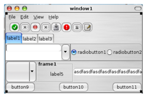
These are the basic gtk+ widgets proposed by Glade. You can get a glimpse of the look of several of these widgets here.
- Window : A top-level widget which can contain other widgets. GTK+ reference manual
- Menu bar : A drop down menu consisting of a list of menu items used to perform application functions. GTK+ reference manual
- Toolbar : Create bars of buttons and other widgets. GTK+ reference manual
- Handle box : A bin widget which displays its child and a handle that the user can drag to tear off a separate window (the float window) containing the child widget. GTK+ reference manual
- Toolbar with buttons : A specialized tool-bar that contains buttons. GTK+ reference manual related topic
- Toolbar with toggle buttons : A specialized tool-bar that contains toggle buttons. GTK+ reference manual related topic
- Toolbar with radio buttons : A specialized tool-bar that contains radio buttons. GTK+ reference manual related topic
- Toolbar with separator item : A specialized tool-bar that contains separators widgets which separates groups of tool-bar items. The separator is either vertical or horizontal depending on the theme. GTK+ reference manual related topic
- Label : Displays a small amount of text. A label widget may contain mnemonics, which are underlined characters used for keyboard navigation. GTK+ reference manual
- Text entry : A single line text entry field. GTK+ reference manual
- Combo box entry : A text entry field with a drop-down list. GTK+ reference manual
- Text view : A multi-line line text entry field. Text is stored in the UTF-8 encoding and might use tags to specify certain attributes, like <bold>. GTK+ reference manual
- Button : A widget that creates a signal when clicked on. It can hold almost any other standard child widget. GTK+ reference manual
- Toggle button : Create buttons which will remain 'pressed-in' when clicked. Clicking again will cause the toggle button to return to its normal state. GTK+ reference manual
- Check button : Create widgets, normally labels, with a discrete toggle button next to it. GTK+ reference manual
- Radio button : A choice from multiple check buttons. When one is selected, all other radio buttons in the same group are deselected. GTK+ reference manual
- Combo box : A widget that allows the user to choose from a list of valid choices. When activated it displays a popup which allows the user to make a new choice. Choice values are not editable. GTK+ reference manual
- Spin button : A combination of a text entry field and two buttons. The user can click on one of two arrows to increment or decrement the displayed value or type it into the text entry. Validation can be performed. GTK+ reference manual
- List or tree view : A widget for displaying both trees and lists. GTK+ reference manual
- Icon view : A widget which displays a grid of icons with labels, with possibility to select one or multiple items. GTK+ reference manual
- Horizontal separator : It displays a horizontal line with a shadow to make it appear sunken into the interface. GTK+ reference manual
- Vertical separator : It displays a vertical line with a shadow to make it appear sunken into the interface. GTK+ reference manual
- Image : A widget displaying an image. The image may be an animation. GTK+ reference manual
- Drawing area : A widget for custom user interface elements. It's essentially a blank widget where you can draw on. GTK+ reference manual
- Dialog : Used to create pop-up windows. GTK+ reference manual
- File chooser dialog : A file chooser dialog box, suitable for "File/Open" or "File/Save" commands. GTK+ reference manual
- Color selection dialog : A standard dialog box for selecting a color. GTK+ reference manual
- Font selection dialog : A dialog box for selecting fonts available on the running system. GTK+ reference manual
- Horizontal box : A container that organizes child widgets into a single row. All children are allocated the same height. GTK+ reference manual
- Vertical box : A container that organizes child widgets into a single column. All children are allocated the same width. GTK+ reference manual
- Table : A container useful to arrange widgets in rows and columns, making it easy to align many widgets next to each other, horizontally and vertically. GTK+ reference manual
- Fixed positions : A container which allows you to position widgets at fixed coordinates, given in pixels, with no automatic layout management. GTK+ reference manual
- Horizontal button box : A container for arranging buttons horizontally. GTK+ reference manual
- Vertical button box : A container for arranging buttons vertically. GTK+ reference manual
- Horizontal panes : A container with two panes arranged horizontally. The division between the two panes is adjustable by the user by dragging a handle. GTK+ reference manual
- Vertical panes : A container with two panes arranged vertically. The division between the two panes is adjustable by the user by dragging a handle. GTK+ reference manual
- Notebook : A container whose children are pages that can be switched between using tab labels along one edge. GTK+ reference manual
- Frame : A bin that surrounds its child with a decorative frame and an optional label. If present, the label is drawn in a gap in the top side of the frame. GTK+ reference manual
- Scrolled Window : A container the accepts a single child widget. It adds scrollbars to the child widget and optionally draws a beveled frame around the child widget. GTK+ reference manual
- Status bar : A widget used to report messages of minor importance to the user. GTK+ reference manual
List of additional widgets
•Standard additional widgets
These are the additional gtk+ widgets (you can get a glimpse of several of these widgets here:
- About dialog : Creates a window to display information about an application. GTK+ reference manual
- Input dialog : A dialog box which allows the user to configure XInput extension devices. This widget is considered too specialized/little-used for GTK+, and will in the future be moved to some other package. GTK+ reference manual
- Toolbar button with menus : A tool-bar item that contains a button and a small additional button with an arrow. When clicked, the arrow button pops up a drop-down menu. GTK+ reference manual
- Toolbar item : The base class of widgets that can be added to tool-bar. GTK+ reference manual
- Horizontal scale : A horizontal slider widget for selecting a value from a range. GTK+ reference manual
- Vertical scale : A vertical slider widget for selecting a value from a range. GTK+ reference manual
- Horizontal ruler : A widget arranged horizontally creating a ruler that is utilized around other widgets such as a text widget. The ruler is used to show the location of the mouse on the window and to show the size of the window in specified units, pixels, inches or centimeters. This widget is considered too specialized/little-used for GTK+, and will in the future be moved to some other package. GTK+ reference manual
- Vertical ruler : A widget arranged vertically creating a ruler that is utilized around other widgets such as a text widget. The ruler is used to show the location of the mouse on the window and to show the size of the window in specified units, pixels, inches or centimeters. This widget is considered too specialized/little-used for GTK+, and will in the future be moved to some other package.GTK+ reference manual
- Alignment : A widget which controls the alignment and size of its child GTK+ reference manual
- Event box : A widget used to catch events for widgets which do not have their own window. GTK+ reference manual
- Calendar : Displays a calendar,one month at a time, and allows the user to select a date GTK+ reference manual
- Progress bar : A widget which indicates progress visually. GTK+ reference manual
- Layout : Infinite scrollable area containing child widgets and/or custom drawing. GTK+ reference manual
- Aspect frame : A frame that constrains its child to a particular aspect ratio. GTK+ reference manual
- Arrow : Displays an arrow pointing in one of the four cardinal directions. GTK+ reference manual
- Expander : A container which allows the user to hide or show its child by clicking on an expander triangle. GTK+ reference manual
- Curve : A widget which allows the user to edit a curve covering a range of values. It is typically used to fine-tune color balances in graphics applications. It has 3 modes of operation - spline, linear and free. This widget is considered too specialized/little-used for GTK+, and will in the future be moved to some other package. GTK+ reference manual
- Gamma curve : A subclass of the curve widget for editing gamma curves. This widget is considered too specialized/little-used for GTK+, and will in the future be moved to some other package. GTK+ reference manual
- Horizontal Scrollbar : A widget arranged horizontally creating a scrollbar. GTK+ reference manual
- Vertical Scrollbar : A widget arranged vertically creating a scrollbar. GTK+ reference manual
- File chooser : File chooser widget that can be embedded in other widgets. GTK+ reference manual
- Color selection : Color chooser widget that can be embedded in other widgets. GTK+ reference manual
- Font selection : Font chooser widget that can be embedded in other widgets. GTK+ reference manual
- Cell view : A widget displaying a single row of a tree model. It doesn't support complex features like cell editing and drag and drop. GTK+ reference manual
- File chooser button : A button to launch a file selection dialog. GTK+ reference manual
- Color chooser button : A button to launch a color selection dialog. It also displays the currently selected color. GTK+ reference manual
- Font chooser button : A button to launch a font selection dialog. GTK+ reference manual
- Popup menu : Edit signals which let widgets have context-sensitive menus. GTK+ related reference manual page
- View port : An adapter which makes widgets scrollable. GTK+ reference manual
- Custom widget : Not a real gtk+ widget. Just a place-holder for custom widgets.
•Deprecated widgets
These widgets are declared deprecated but still supported :
- Columned list
- Columned tree
- List
- Combo box
- File selection dialog
- Option menu
- Preview
•GNOME specific additional widgets
With Glade one can create GNOME specific projects. These are the GNOME specific widgets proposed by Glade :
- GNOME application window
- Druid
- GNOME canvas
- Icon selection
- GNOME icon entry
- GNOME HRef link button
- GnomeDataEdit
- GNOME application bar
- Bonobo control
These are the GNOME specific widgets declared deprecated but still supported :
- GNOME pixmap
- GNOME dialog box
- GNOME message box
- Property dialog box
- GNOME about dialog
- Icon list
- GNOME entry
- GNOME file entry
- GNOME pixmap entry
- GNOME color picker
- GNOME font picker
Disposition of tools in the environment and the environment itself
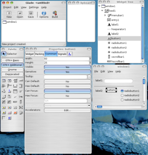
The Glade UI designer, or builder as they like to call it, presents the user a multiple-detached-windows environment. The following screen-shot shows these windows.
1.) The Glade (main) window
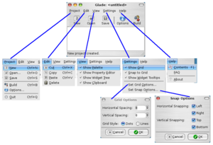
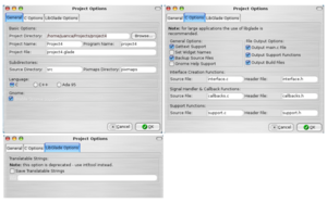
- This is where the application's menus and main tool-bar are located. From this window the user can choose whether to create, open or save a project, change the options for the working project, like the project's directory, project's name, XML description file, the programming language whose code might result as an export/build command, as well as support for translation via the gettext library.
- From this window you have access to editing commands like cut, copy, paste and delete via menu entries.
- The menu also provides the only way to show/hide the rest of the 'tool' windows. From the menu you can also set grid options, like displaying it, snapping objects to it and how the grid is display and how snapping behaves. You can also decide whether or not to display widgets' tool-tips while working on the interface.
- The menu has entries for off-line documentation and FAQs. In my system the package 'glade-doc-2' needed to be installed. Different distributions might or not need this extra package to work properly.
2.) The Palette window
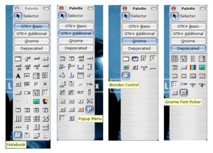
- This is where all the available widgets are. You can select the set of widgets to display (basic, additional or deprecated, and Gnome widgets if you decided to create a Gnome project) by clicking on labeled buttons and the content of the palette window is updated as needed. This window has a minimum size in order to prevent widgets to be hidden.
3.) The Properties window
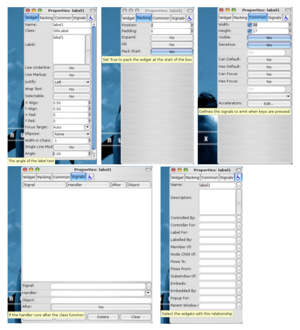
- This is the place where you can change values for the widgets, like its name, text, position, packing options, tool-tips, response to windowing or user generated signals, and interaction with other widgets, like parenthood, control by other widgets, and the alike. These are just some of the properties that one can change. Every widget has its own set of properties, thus the contents of the properties window is dynamically redisplayed as needed.
4.) The Widget Tree window
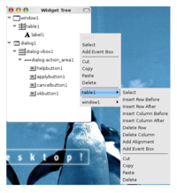
- This windows shows a tree-like representation of the widgets and their relationship in the working project. This is handy to navigate and select a certain widget, namely those that are not very 'visible' like drawing areas or tool-bar items with no content.
5.) The Clipboard window
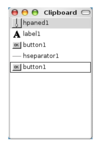
- In this window you can visualize which widgets have been place into a buffer and are ready to be pasted into another widget or area.
When Glade is first launched by default every child window is grayed-out, you can only interact with the main window to perform basic actions like opening or creating projects.
Glade is very basic in the way is handles the creation of new projects : no wizards and no templates are available. You don't have the possibility to create new applications, i.e. main windows+menu bar+tool-bar+buttons, from templates or wizards. On the contrary you have a basic set of predefined gtk+ dialog boxes, file/color/font-chooser, standard/about/input dialog boxes, which are very configurable.
You are limited to work on only one project at a time. If you want to edit two projects at a time you can either run multiple instances of Glade or just close a project and open another one, which is really tedious. In either case the projects are not related one to another. *Note* Support to work with multiple projects is expected in Glade 3.
Glade doesn't propose a proper 'working canvas' the way image editors do. There is not a specific area were you can add and edit your widgets : your 'canvas' is the desktop. To add widgets you have to create a top-level container, like a window or a dialog box, and add them there. This is disorienting for first-time users as you don't see where you can add your widgets, but on the other hand you are not "limited" in space : your desktop is your limit. So in order to have a working area you have to create (or open) a project AND select a top-level container like a window or a dialog box. Even though size is not a matter for the 'working canvas', the desktop is the limit, visibility IS a big matter. When you are working with multiple applications at the same time, you will have to look around for the Glade windows that get hidden when you activate another application. And what is worse clicking on any of the Glade windows doesn't pop up the other siblings.
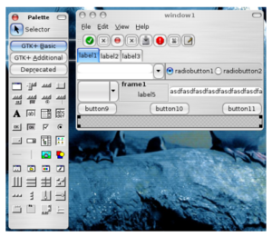
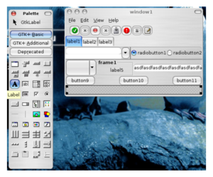
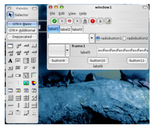
As stated above, the place from where you can select the different widgets is the 'Palette' window. By default this window is visible, but grayed-out, when you first launch Glade. If you don't see it, you have to use the main window menu and select 'View'->'Show Palette'. Once you have created (or opened) a project all the widgets are available for selection. To add a widget to a top-level container, window or dialog box, you simply click on a button in the 'Palette' window and then click on the top-level container. There is no support for drag-and-drop and to add the same type of widgets multiple times you have to re-select the widget from the 'Palette' window. Once the widget is added it is deselected in the top-level container.
Support for cut, copy, paste and deletion is assured. You can use the standard keyboard-shortcuts to perform these actions, CRTL+C=copy, DELETE=deletion. BUT don't expect the usual UNDO action, there is no support for this. *Note* : Support for undo is expected in Glade 3.
You cannot copy/paste specific attributes of one widget to another. But when you copy/paste a widget ALL its attributes are copied and maintained intact, with the exception of the widget's name.
Glade doesn't have editing modes, it lets you change all attributes of the widgets via the 'Properties' window. This windows has four tabs
- ) The 'Widget' tab lets you change attributes specific to the widget, like its name, the gtk+ class it belongs to and many others depending on the selected widget.
- ) The 'Packing' tab lets you change packing properties, like the position in pixels of the widget relative of a packing widget, if it extends completely horizontally/vertically. This tab might be grayed-out for certain widgets, like top-level windows.
- ) The 'Common' tab lets you change attributes like the absolute height and width of a widget, tool-tips, accelerators and to what events it should be sensible, among others.
- ) The 'Signals' tab lets you specify a list of signals the widget will respond to, and the handler/callback that will treat this signal. The code for the signal cannot be edited. You can also specify which object's handler will treat the signal.
- ) The fifth tab, doesn't have a name just a icon of a person on a wheel-chair, lets you specify interaction between widgets, like who this widget controls or is controlled by, for whom this widget is a pop-up window in the case of dialog boxes, who this widget labels or is labeled by, among other properties.
The contents of the 'Properties' window adapts itself dynamically to reflect only the properties specific to the widget currently selected.
There is no real-time preview mode.
To change the attributes of a widget you have to select it with a left-click and look around in the 'Properties' window for the attribute you want to change. Here you can change the layout and position of the widget, but you cannot specify the tabbing order for keyboard navigation. You can specify responses to certain windowing events, like resize, show, click, etc, but you cannot specify or personalize the response-code to these events. Concerning font changes gtk+ takes care of those automatically, but if you use a 'fixed' layout container chances are there won't be enough space to properly re-dimension the widgets.
Support for multi-language is provided via the gettext library (another external dependency).
Resources like external-images are copied into a subdirectory in the root directory of the project.
Variables names in Glade should be unique. The default convention used is to use the lowercase name of the gtk+ class the widget belongs to, without the 'Gtk' prefix that all these classes have, suffixed by the count of widgets of that class that have already been added in the project, i.e. button6, hseparator2. The count of added widgets is only reset to zero when another project is created/opened. When you specify a name that already exists the designer prompts an error message and resets the name to the default/previous value. The default value for labels and labels of buttons is the same as the widget's name.
There exists some visual aids for the user, like tool-tips on almost all of the interface elements, buttons, labels in the 'Properties' window, though they might not be 'too' explanatory for first-time users. The main window has a status bar, but it utilization is limited to announcing events like project creation/saving/loading, source code generation. Announcing events that happen in the editing process are not listed. There are links for off-line help and F.A.Q, but depending on the system you will have to add an extra package. This help is really basic even for first-time users and definitely not aimed for expert users.
By default the interface description is saved in an XML format. You can build source code for C and ADA, you can find many more libraries for building sources for other languages, like the glademm library for C++, but this feature is highly discouraged and will be removed in Glade 3. They suggest the use of the libglade library to load and parse the XML description at runtime.
For the future of Glade take a look here. One interesting new feature is "Catalogs of widgets that are "pluggable", this means that external libraries can provide their set of widgets at runtime and Glade will detect them".
Using the designer
In this section we will create a very simple user interface. We will try to use only the basic gtk+ widgets proposed by Glade. We will avoid using the 'Fixed Positions' container as it does not support automatic layout management.
Time spent : less than 10 minutes as I was already acquaintance with Glade.
Adding widgets is simple, though tedious if you would like to add multiple instances of the same type, for instance to add 8 buttons you have to select 8 times the button widget from the 'Palette' window. To select added widgets you can either left-click on it or right-click and select it from a pop-up menu. To edit menus you have an extra window, the 'Menu Editor' window, which is accessible from the 'Properties' Window in the 'Widget' tab, or by right-clicking on the menu-widget and selecting it from the pop-up menu.
| Steps performed to add a widget. Step 1 : select the "spot" where you want to place the widget. This "spot" is either a cell of a box/table container or any place in a fixed position container. Step 2 : select the widget you want to add by clicking on a button in the 'Palette' window. Notice that a tool-tip pop-ups indicating the name of the selected widget and that the button gets the focus. Step 3 : left-click on the "spot" you want to add the widget. The widget will be added, the selected widget button will loose the focus and the 'Selector' button will gain it. That's all. | ||
To layout the widget is a bit tricky, if you are not aware of how layout works : layout containers other than the 'Fixed Position' container expand by default horizontally and vertically the size of its members to fill up all the available space of the window/dialog box. On the other hand, if you don't specify a size in the 'Common' tab of the 'Properties' window the widgets are packed to occupy the minimum space needed to be gracefully displayed. In that sense Glade is not really WYSIWYG, you might have been working on a big dummy-window, but when compile and run the application you'll see everything is packed tightly and your resulting window much smaller than expected. But on the other hand layout is automatically taken care of by the windowing system.
Changing attributes is quite simple through the 'Properties' window. But on the other hand it's sort of tricky to select/move widgets like containers and frames, either you cannot select them with just one click, or you cannot simply move them around the 'working canvas'.
Text strings for text-entries, text-views, and labels might be really long, tested with string up 1400 characters and everything went O.K. Text strings are not limited up to 255 chars like in Visual Studio 2003.
All windowing/user triggered events proposed by gtk+ are supported. You can indicate the name of the handler, and eventually the object this handler belongs to, but you cannot edit/customized the code of the handler.
Editing the XML description by hand and reloading it into Glade is not a problem. It seems that having certain minor errors, like strings were values are expected, using non-recognized tags, is handled OK. On the other hand having important errors, like no closing tags, results in the project not being loaded.
Glade depends on gtk or gtk+. To generate source code you have to have many additional packages, like the gtk+ development libraries, gtkmm and gtkmm-dev, gettext for translations, and many others depending on the results you want from Glade. If you want just to create an XML description the glade package is enough, plus obviously gtk+.
To incorporate generated source code, though this feature is highly discouraged, you can simply copy the source files to your own project, or copy pieces of code that describes the allocation and assignment of objects. More advised is the use of libglade, a library which parses at runtime the XML description and creates as necessary the interface.
In conclusion, Glade is a very simple, basic and very user-friendly UI designer/builder, but it lacks many features asked in todays working world, like drag-and-drop, more WYSIWYG compliance, runtime preview, undo, working with multiple projects. But it remains a really good tool to design gtk interfaces.
This study was undertook by a software engineering student and not an expert in the gtk+/Glade field; even though rigorousness was a key element certain assertions might still be wrong.
