Beginning Plotting
From KitwarePublic
Jump to navigationJump to search
Introduction
This use case shows a user how to plot cell and point data. Plotting can be along a line that cuts through your data, or a location with respect to time.
Plot along a line
- Open can.exo. Turn on all data. Apply.
- Drag the can around with the left mouse button until you can see the can.
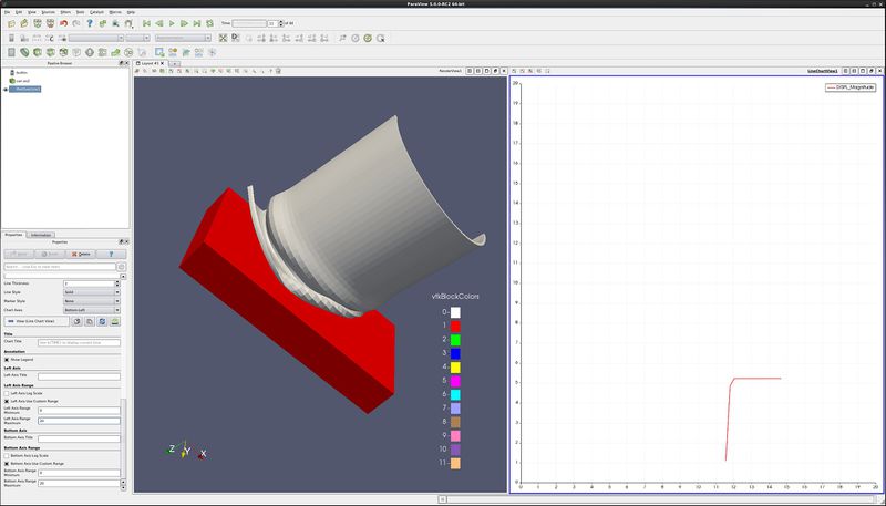
- Filter→Data Analysis→Plot Over Line. Drag the top of the line to intersect the top of the can. Note that hitting the p key will also place the line on the surface of your object. Apply.
- Display tab. Unselect all variables except DISPL:Magnitude.
- Right click on the vertical scale→Properties→Left Axis→Layout and select Specify the Axis Range. Input a Minimum of 0.0 and Maximum of 20.0.
- Right click on the horizontal scale→Properties→Bottom Axis→Layout and select Specify the Axis Range. Input a Minimum of 0.0 and Maximum of 20.0.
- Play the animation forward, and notice what happens to the plot.
Plot point over time
- Open can.exo. Turn on all data. Apply.
- Drag the can around with the left mouse button until you can see the can.
- We want to plot a point over time. First, we need to select a point.
- Note: Turn the Style Representation to Surface With Edges, allowing you to see the points (nodes).
- Click on Select Points On icon. Then, rubber band select around a point.
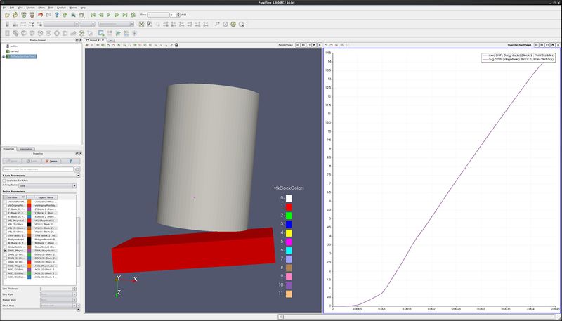
- Filters→Data Analysis→Plot Point Over Time. Apply.
- Display tab, unselect Point Coords, ACCL and VEL.
- You now have a plot of the displacement. at your point.
- Extra Credit – Using Select Cells On icon, and the Plot Cell Over Time, plot EQPS over time.
Plot two variables at same time
- Follow the steps for Plot Point over time, as described above.
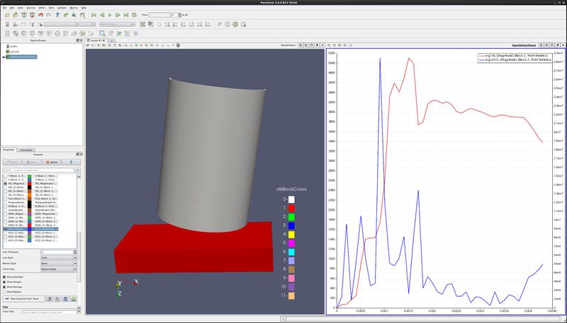
- On the Display tab, only display variables VEL (Magnitude) and ACCL (Magnitude).
- Select the line that says ACCL (Magnitude), causing this row to turn gray.
- At the bottom of the Display tab, change Chart Axes to Bottom-Right.
Acknowledgements
Sandia is a multiprogram laboratory operated by Sandia Corporation, a Lockheed Martin Company, for the United States Department of Energy’s National Nuclear Security Administration under contract DE-AC04-94AL85000.


