ParaView/Displaying Data: Difference between revisions
| Line 360: | Line 360: | ||
* Right-click and drag to pan | * Right-click and drag to pan | ||
* Left-click and drag to select | * Left-click and drag to select | ||
* Middle-click and drag to zoom to region drawn | * Middle-click and drag to zoom to region drawn. | ||
* Hover over any line in the plot to see the details for the data at that location. | |||
To reset the view, use the '''Reset Camera''' [[Image:ParaViewUsersGuideResetCamera.png]] button in the '''Camera Toolbar'''. | To reset the view, use the '''Reset Camera''' [[Image:ParaViewUsersGuideResetCamera.png]] button in the '''Camera Toolbar'''. | ||
Revision as of 15:16, 19 January 2011
The goal of visualization is to generate representations of the data in a visual form. In this chapter we will see different mechanisms available in ParaView to look at the data to gain insight into it.
Understanding Views
Views
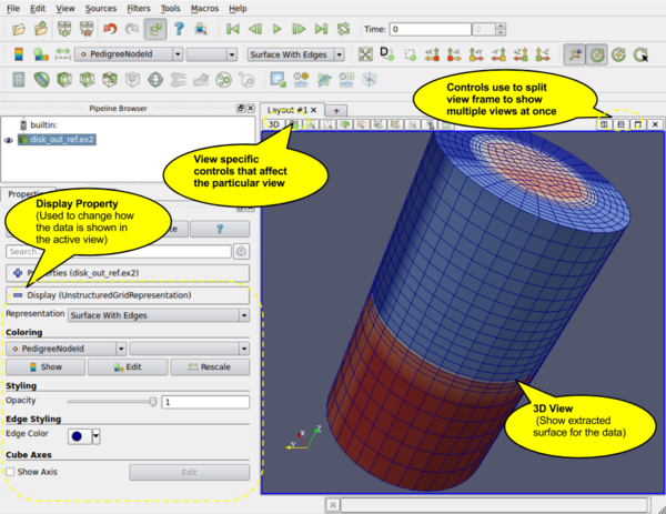
When the ParaView application starts up, one sees a 3D viewport with an axes at the center. This is a View. In ParaView, Views are frames in which the data can be seen. There are different types of views. The default view that shows up is a 3D View which shows rendering of the geometry extracted from the data or volumes or slices in a 3D scene. You can change the default view Settings dialog (Edit | Settings (in case of Mac OS X, ParaView | Preferences)).
There maybe parameters that are available to the user that control how the data is displayed e.g. in case of 3D View, the data can be displayed as wireframes or surfaces, you choose to change the color of the surface or use a scalar for coloring etc. All these options are known as Display properties and are accessible from the Display tab in the Object Inspector.
Since there can be multiple datasets shown in a view, as well as multiple views, the Display tabs shows the properties for the active pipeline object (changed by using the Pipeline browser, for example) in the active view.
Multiple Views
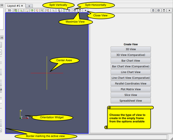
ParaView supports showing multiple views side by side. To create multiple views, simply use the controls on the top-right corner of the view to split the frame vertically or horizontally. You can even maximize a particular view to temporarily hide other views. Once a view-frame is split, you will see a list of buttons showing the different types of views that you can create to place in that view. Simply click the button to create the view of your choice.
Some filters, such as Plot Over Line may automatically split the view frame and show the data in a particular type of view suitable for the data generated by the filter.
Active View
Once you have multiple views, the active view if indicated by a colored border around the view frame. Several menus as well as toolbar buttons affect the active view alone. Also they may become enabled/disabled based on whether that corresponding action is supported by the active view.
The Display tab affects the active view. Similarly, the eye icon in the Pipeline Browser, next to the pipeline objects, indicates the visibility state for that object in the active view.
When a new filter or source or reader is created, it will be displayed by default in the active view, if possible (otherwise, if may create a new view).
Types of Views
In this section we will cover the different types of Views available in ParaView. For each view, we will talk about the controls available to change the view parameters using View Settings as well as the parameters associated with the Display Tab for showing data in that view.
3D View
3D View is used to show the surface or volume rendering for the data in a 3D world. This is the most commonly used view type.
When running in client-server mode, 3D View can render data either by bringing the geometry to the client and then rendering it there or by rendering it on the server (possibly in parallel) and then delivering the composited images to the client. Refer to the Client-Server Visualization chapter for details.
Interaction
Interacting with the 3D view will typically update the camera. This makes it possible to explore the visualization scene. The default buttons are as follows, they can be changed using the Application Settings dialog.
| Modifier | Left Button | Middle Button | Right Button |
|---|---|---|---|
| Rotate | Pan | Zoom | |
| Shift | Roll | Rotate | Pan |
| Control | Zoom | Rotate | Zoom |
This view supports selection. One can select cells or points either on the surface or those within a frustum. Selecting cells or points makes it possible to extract those for further inspection or label them etc. Details about data querying and selection can be found the Quantitative analysis chapter.
View Settings
The view settings dialog accessible through the Edit | View Settings menu or the tool button on the left-corner of the view is used to change the view settings per view.
General
This tab allows the user to choose the background color. One can use a solid color or a gradient or even a background image.
By default the camera uses perspective projection. To switch to parallel projection, check the "Use Parallel Projection" checkbox in this panel.
Lights
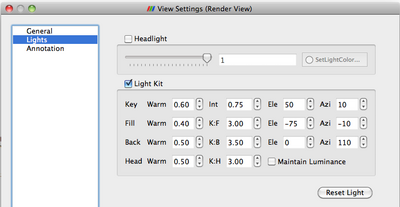
The 3D View requires lights to illumniate the geometry being rendered in the scene. Once can control these lights using this pane.
Annotation
The annotation pane enables controlling the visibility of the center axes and the orientation widget. Users can also make the orientation widget interactive, so that they can manually place the widget at location of their liking.
Display Properties
Users can control how the data from any source or filter is shown in this view using the Display tab. In this section we will cover the various options available to a user for controlling appearance of the rendering in the 3D view.
View
| Name | Usage |
|---|---|
| Visible | Checkbox used to toggle the visibility of the data in the view. If it disabled, it implies that the data cannot be shown in this view. |
| Selectable | Checkbox used to toggle whether the data gets selected when using the selection mechanism for selecting and sub-setting data. |
| Zoom to Data | Click this button to zoom the camera so that the dataset is completely fits within the viewport. |
Color
The color group allows users to pick the scalar to color with or set a fixed solid color for the rendering.
| Name | Usage |
|---|---|
| Interpolate Scalars | If on, the scalars will be interpolated within polygons and the scalar mapping happens on per pixel basis. If off, then color mapping happens at points and colors are interpolated which is typically less accurate. This only affects when coloring with point arrays. Has no effect otherwise. This is disabled when coloring using a solid color. |
| Map Scalars | If the data array being color with can be directly interpreted as colors then one can uncheck this to not use any lookup table. Otherwise, when on, a lookup table will be used to map scalars to colors. This is disabled when the array is not of the type that can be interpreted as colors (i.e. vtkUnsignedCharArray). |
| Apply Texture | Makes is possible to apply a texture over the surface. This requires that the data has texture coordinates. One can use filters like Texture Map to Sphere, Texture Map to Cylinder or Texture Map to Plane to generate texture coordinates when not present in the data. To load a texture, select Load from the combo-box which will popup a dialog allowing you to choose an image. Otherwise pick from already loaded textures listed in the combo-box. |
| Color By | This enables coloring of the surface/volume. Either choose the array to color with or set the solid color to use. When volume rendering, solid coloring is not possible, one has to choose the data array to volume render with. |
| Set solid color | Used to set the solid color. This is available only when Color By is set to use Solid Color. ParaView defines a notion of a color palette consisting of different color categories. To choose a color from one of these predefined categories, click on the tiny arrow next to thus button. It will open up a drop down with options to choose from. If one uses a color from the palette, it possibly to globally change the color by changing the color palette e.g. for printing or for display on screen etc. |
| Edit Color Map... | One can edit the color-map or lookup table by clicking the Edit Color Map button. It's only shown when an array is chosen in the Color By combo-box. |
Slice
The slice controls are available only for Image dataset (Uniform Rectilinear Grids) when the representation type is Slice. The representation type is controlled using the Style group on the Display tab. These allow the user to pick the slice direction as well as the slice offset.
Annotation
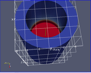
Cube axes is a annotation box that can be used so show a scale around the dataset. Use the Show cube axes checkbox to toggle its visibility. You can further control the apperance of the cube axes by clicking Edit once the cube-axes is visible.
Style
| Name | Usage |
|---|---|
| Representation | Use this to change how the data is represented i.e. as a surface, volume,
wireframe, points, or surface with edges. |
| Interpolation | Choose the method used to shade the geometry and interpolate point attributes. |
| Point Size | If your dataset contains points/vertices, this adjust the diameter of the rendered points. It also affects the point size when Representation is Points. |
| Line width | If your dataset contains lines/edges, this scale adjust the width of the rendered lines. It also affects the rendered line width when Representation is Wireframe or Surface With Edges. |
| Opacity | Set the opacity of the dataset's geometry. ParaView uses hardware-assisted Depth peeling, whenever possible, to remove artifacts due incorrect sorting order of rendered primitives. |
| Volume Mapper | When Representation is Volume, this combo-box allows the user to choose a specific volume rendering technique. The techniques available change based on the type of the dataset. |
| Set Edge Color | This is available when Representation is Surface with Edgets. It allows the user to pick the color to use for the edges rendered over the surface. |
Backface Style
This allows the user to define backface properties. In computer graphics, backface refers to the face of a geometric primitive with the normal point away from the camera. Users can choose to hide the backface or front face or specify different characteristics for the two faces using these settings.
Transformation
These settings allow the user to transform the rendered geometry, without actually transforming the data. Note that since this transformation happens during rendering, any filters that you apply to this data-source, will still be working on the original, untransformed data. Use the Transform filter if you want to transform the data instead.
2D View
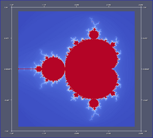
2D View is similar to 3D view except that it can only show slices from uniform grid datasets i.e. volume datasets or image datasets. The interaction is also limited to a 2D plane i.e. rotation is not available. Currently this view does not support selection. That will be supported in future releases. When one loads a 2D image, ParaView by default creates this view.
Since this view is same as the 3D view, it has the same features when it comes to client-server and parallel rendering.
Interaction
Interactions with this view update the camera. The default buttons are as follows, they can be changed using the Application Settings dialog.
| Modifier | Left Button | Middle Button | Right Button |
|---|---|---|---|
| Pan | Pan | Zoom | |
| Shift | Zoom | Zoom | Zoom |
| Control | Zoom | Zoom | Pan |
Unlike 3D view, this view currently does not support selection. However, that support will be added in future.
View Settings
The view settings dialog accessible through the Edit | View Settings menu or the tool button on the left-corner of the view is used to change the view settings per view.
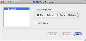
The user can change the background color and toggle the visibility of the axes-box.
Display Properties
Display tab for this view is exactly same as the 3D View, except that some options may be unavailable such as changing of representation type.
Spreadsheet View
Spreadsheet View is used to inspect the raw data in a spreadsheet. When running in client-server mode, to avoid delivering the entire dataset to the client for displaying the spreadsheet (since the data can be very large), this view streams only visible chunks of the data to the client. As the user scrolls around the spreadsheet, new data chunks are fetched.
Unlike some other views, this view can only show one dataset at a time. For composite datasets, it shows only one block at a time. One can pick the block to show using the Display tab.
Interaction
As far as the usability is concerned, this view behaves exactly like typical spreadsheets shown in applications like Microsoft's Excel or Apple's Pages:
- One can scroll up and down to inspect new rows.
- One can sort any column by clicking on the header for the column. Repeated clicking on the column header toggles the sorting order. When running in parallel, ParaView uses sophisticated parallel sorting algorithms to avoid memory and communication overheads to sort large, distributed datasets.
- One can double-click on a column header to toggle a mode in which only that column is visible. This reduces clutter when one is interested in a single attribute array.
- One can click on rows to select the corresponding elements i.e. cells or points. This is not available when in "Show selected only mode" (explained later). Also, when one creates a selection in other views e.g. the 3D view, the rows corresponding to the selected elements will be highlighted.
Header
Unlike other views, Spreadsheet View has a header. This header provides quick access to some of the commonly used functionality in this view.
- Since this view can only show one dataset at a time, one can quickly choose the dataset to show using the Showing combo-box.
- One can choose the attribute type i.e. point attributes, cell attributes, to display using the Attribute combo-box.
- Precision controls the number of digits to show after decimal point for floating point numbers.
- The last push-button allows the user to enter the view in a mode where it only shows the selected rows. This is useful when one creates a selection using another view such as the 3D view and wants to inspect the details for the selected cells/points.
View Settings
Currently, no user settable settings are available for this view.
Display Properties
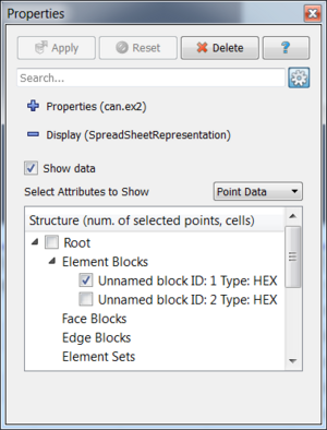
The display properties for this view provide the same functionality as the header. Additionally, when dealing with composite datasets, the display tab shows a widget allowing the user to choose the block to display in the view.
Line Chart View
A traditional 2D line plot is often the best option to show trends in small quantities of data. A line plot is also a good choice to examine relationships between different data values that vary over the same domain.
Any reader, source, or filter that produces plottable data can be displayed in an XY Plot View. ParaView stores its plottable data in table (vtkTable). Using the display properties, users can choose which columns in the table must be plotted on the x and y axes.
As with the other view types, exactly what is displayed in the active XY Plot View is displayed by, and controllable with, the eye icons in the Pipeline Browser panel. When an XY Plot View is active, only those filters that produce plotable output have eye icons.
The XY Plot View is the preferred View type for the Plot over Line, Plot Point over Time, Plot Cell over Time, Plot Field Variable over Time, and Probe Location over Time filters. Creating any one of these filters will automatically create an XY Plot View for displaying its output. Figure 3 shows a plot of the data values within a volume as they vary along three separate paths. The top curve comes from the line running across the center of the volume, where the largest values lie. The other two curves come from lines running near the edges of the volume.
Unlike the 3D and 2D render view, the charting views are client-side views i.e. they deliver the data to be plotted to the client. Hence ParaView only allows results from some standard filters such as Plot over Line in the line chart view by default. However it is also possible to plot cell or point data arrays for any dataset by apply the Plot Data filter.
Interaction
Line chart view supports the following interaction modes:
- Right-click and drag to pan
- Left-click and drag to select
- Middle-click and drag to zoom to region drawn.
- Hover over any line in the plot to see the details for the data at that location.
To reset the view, use the Reset Camera File:ParaViewUsersGuideResetCamera.png button in the Camera Toolbar.
View Settings
The View Settings for Line Chart enable the user to control the appearance of the chart including titles, axes positions etc. There are several pages available in this dialog. The General page controls the overall appearance of the chart, while the other pages controls the appearance of each of the axes.
General Settings Page
This page allows users to change the title and legend. One can change the title text. To show the current animation time in the title text, simply use the keyword ${TIME}. Users can further change the font and alignment for the title.
This page also enable changing the appearance and positioning of the legend.
Axis Settings Page
This page allows changing the properties of a particular axis. Four pages are provided for each of the axes. By clicking on the name of the axis, one can access the settings page for the corresponding axes.
- Axis
- Show Axis : controls the axis visibility.
- Show Axis Grid: controls whether a grid is to be drawn perpendicular to this axis.
- Colors: enables changing the axis as well as the grid color.
- Labels
- Show Axis Labels When Space is Available : controls label visibility along this axis.
- Font and Color: enables changing the label font and color.
- Notation: allows user to choose between Mixed, Scientific and Fixed point notations for numbers.
- Precision: controls precision after '.' in Scientific and Fixed notations.
Axis Layout Page
This page allows the user to change the axis range and scale.
- Use Logarithmic Scale When Available: check this to use a log scale unless the data contains numbers <= 0.
- Let the Chart Determine the Axis Layout: pick this radio button to let the chart use the optimal range and spacing for this axis.
- Specify the Axis Range: pick this radio button to specify the axis range explicitly. The labels are auto-placed within this range.
- Specify Each of the Axis Labels: pick this radio button to specify each label location on axis explicitly.
Axis Title Page
This page allows the user to change the title for the axis. One can change the text as well as color and font for the axis title.
